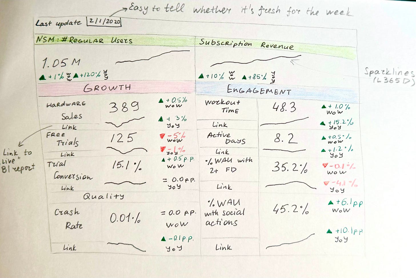
This dashboard could've been a… spreadsheet?
Taming dashboard sprawl is a hot topic - I’ve faced this challenge too. Today I will let you in on a secret: my most powerful dashboard ever was built in Google Sheets. And I had to manually update it
“Google Sheets… manually update it.. Gasp! What are you, in finance?”
I am not from a finance background, but I did have to get very good at spreadsheets when working in the media industry, so that definitely played a part in my eventual “platform” choice (to get things done quickly), but that is not the moral of the story. The point is that if you have a well-structured set of interpretable and actionable metrics, and you can present them to the right people concisely yet with enough context to interpret trends as ‘good’ or ‘concerning’ - you don’t need bells and whistles of shiny new tools and a team of analytics engineers.
As I transitioned from an individual contributor to a manager at Peloton, more and more often I started working directly with executives. And I started seeing a pattern. One VP asked our team to restructure and refresh some reporting in Amplitude. We did that. Next, the chief product officer asked us to build a new Looker dashboard (and mind you, there were already quite a few dashboards there) with specific semi-novel metrics. A couple of weeks later, he came back requesting a different, larger, set of metrics - all cut five different ways.
This pattern suggested that it was hard for the leadership to reason about product performance - there was no single mental model, and the growing number of artifacts across different analytics and reporting tools was making things worse, not better.
First things first - a metrics tree
Of course, the first step was to define the metrics, and preferably a smaller set than 10 metrics x 5 slices. I won’t belabor this point, as I’ve touched upon it in the last week’s newsletter and I go over it in depth in my product analytics course, but using a logical structure (a tree or a loop) is the best way to create the KPI organization.
We picked a tree-like structure, where a newly workshopped North Star Metric (we workshopped it with non-technical stakeholders completely qualitatively - without even looking at the data or running a single regression) - # of regular users (those who worked out at least three of the last four weeks) - that led into the main business metric, subscription revenue.
North Star Metric branched out into growth metrics (hardware sales, new subscription funnel), engagement metrics (workout regularity, workout variety, social engagement on the platform), and quality metrics (reported issues per 1000 engaged users, crash rates, and so on).
While that is 80% of success already, without the last 20% - delivery of a dashboard with real data - it is just a theoretical concept that sounds awesome, but may be completely divorced from reality.
Speed over perfection
So, now I’ve gotta build this out. And at that point, in the late 2019, while our company had Looker, Amplitude, all the data nicely collected in the data warehouse, and some ETL set up going strong, my team had absolutely no resources on the data engineering side, nobody on my team (including myself) knew anything about creating pipelines, and the pipeline and orchestration tools we had in place were not as low-entry as, say, dbt.
To add an insult to injury, a couple of data points were coming from tools without a data export functionality (hi, NewRelic!), and I really wanted to try and have all the metrics in one place.
Lastly, I needed the presentation of this dashboard to be very concise and effective:
Most recent value of the metric (mostly, the last complete week of data, we didn’t need anything updated daily, and definitely not real-time)
Week-over-week and year-over-year deltas to show the recent trend and the seasonality (fitness industry is very seasonal! Everyone wants to get fit in the first two weeks of January, but in the summer people are too busy to work out)
The shape of the trend to give a general idea whether the recent movement is out of the ordinary and needs a double-click
This is all, of course, doable in Looker but not without some degree of clunkiness. The ‘number’ chart can only have a single comparison, the grid is limiting when it comes to layout, even the smallest readable chart tiles are pretty big - I want my dashboard to fit in a single screen!
But Google Sheets… you can resize and merge cells as needed, instead of line charts - in-cell sparklines, some conditional formatting for over-time deltas to pop 👩🍳😘.
Best of all - no need to pay ‘per seat’ (I know!) for folks to view it, while still being able to control access. For added confidentiality, the actual dashboard was just an ‘importrange’ function that you can put into a single cell to render the contents of an entire tab in a completely separate sheet without transferring any underlying data or formulas.
Look at her, she is a beaut (I wish I’d saved a copy of it before leaving, had to draw this one from memory)
And while I did have to update it manually, it didn’t take me much time beyond clicking a couple of buttons to sync fresh data from Looker (via Looker API) and Amplitude (via Sheets plugin), running two SQL queries, and copy-pasting a few numbers from NewRelic. A bonus of a manual update was that I could catch and resolve any data issues before they became visible to the team.
The Sheet Lives On
Once the dashboard was shipped, I started posting highlights weekly in a leadership channel and discussing the metrics in monthly leadership meetings. The metrics started becoming a common knowledge, and we trained ourselves to more and more precisely anticipate which trend movements would propagate to revenue movements.
Of course, I could have spent a couple of weeks instead of a couple of days to put it all together, and figure out ways to build production-grade pipelines, but it was more important to timely fulfill the need to align on the KPIs and pressure-test the chosen metrics.
And truly, nobody cared that it was really just a fancy spreadsheet.
The dashboard lived on for a few seasons. A couple of years in, of course, it was already starting to feel limiting - now that the metrics were common vernacular, we wanted to be able to slice them right there (versus clicking out to each specific chart in the BI tool), we wanted to introduce targets, expected ranges for metrics. But by that point, we already had dbt, analytics engineers, so it became much easier to achieve.
I left the company before I got to see this automation through but I still think that the metrics framework with this little spreadsheet on top was my most meaningful project to date.
Alright, now with my confession is out of the way - what are some absolutely normcore things have you done as a data person that have had an outsized impact?


